Keeping Score

The Ask: How might we streamline internal reports?
For this major health and wellness brand, creating supply chain reports is time-consuming and error prone. I was part of a lean team of designers that jumped in to visualize and prototype a new reports platform.
Through observations, user interviews, and prototyping, we derived a set of system requirements and visual guidelines for a more efficient online reporting tool that requires little training for new users.
"Just let me browse through all the data" —
The user base for this platform is made up of business savvy engineers. During interviews, newer users across regions expressed frustration with the complexity of current reporting tools. In sessions where users tested an early prototype, most were able to navigate the data hierarchy without any additional instructions.
After testing the prototype, users reported they would be able to save up to 6 hours every month.
Designed in Collaboration with SMEs
I lead a working session with 4 subject matter experts that had extensive knowledge of the supply chain sectors from each global region. The session focused on active participation. I captured requirements on paper. At the end of the session, the group distilled the target user base into three distinct groups.
Each of the regions manages data storage differently. Because the multiple systems do not talk to each other, the most active users of this platform would be high-level executives that receive reports from their regions and also report up to leadership.
By prioritizing the regional level group, we guaranteed to isolate instances where data exchanges are currently not taking place.

Photo summary — User groups, key issues and interaction needs captured during SME workshop

Working Session Recap— Collaborative wire-framing with SMEs

Working Session Outcomes — Key screens and functionality for an early prototype
Building and Testing with an Interactive Prototype


After the working session, I worked with another design researcher to create a working prototype using Sketch and Invision.
We tested these key functionality of menus, filtering, and data display. Each interview (or contextual inquiry) followed a structured discussion guide, as well as ethnographic field observations.
We tested the prototype with multiple users in all five global regions and gleaned powerful insights. For example, because the majority of our participants did not speak English as their primary language, we were able to discuss how icons and labels were working before any development was underway.

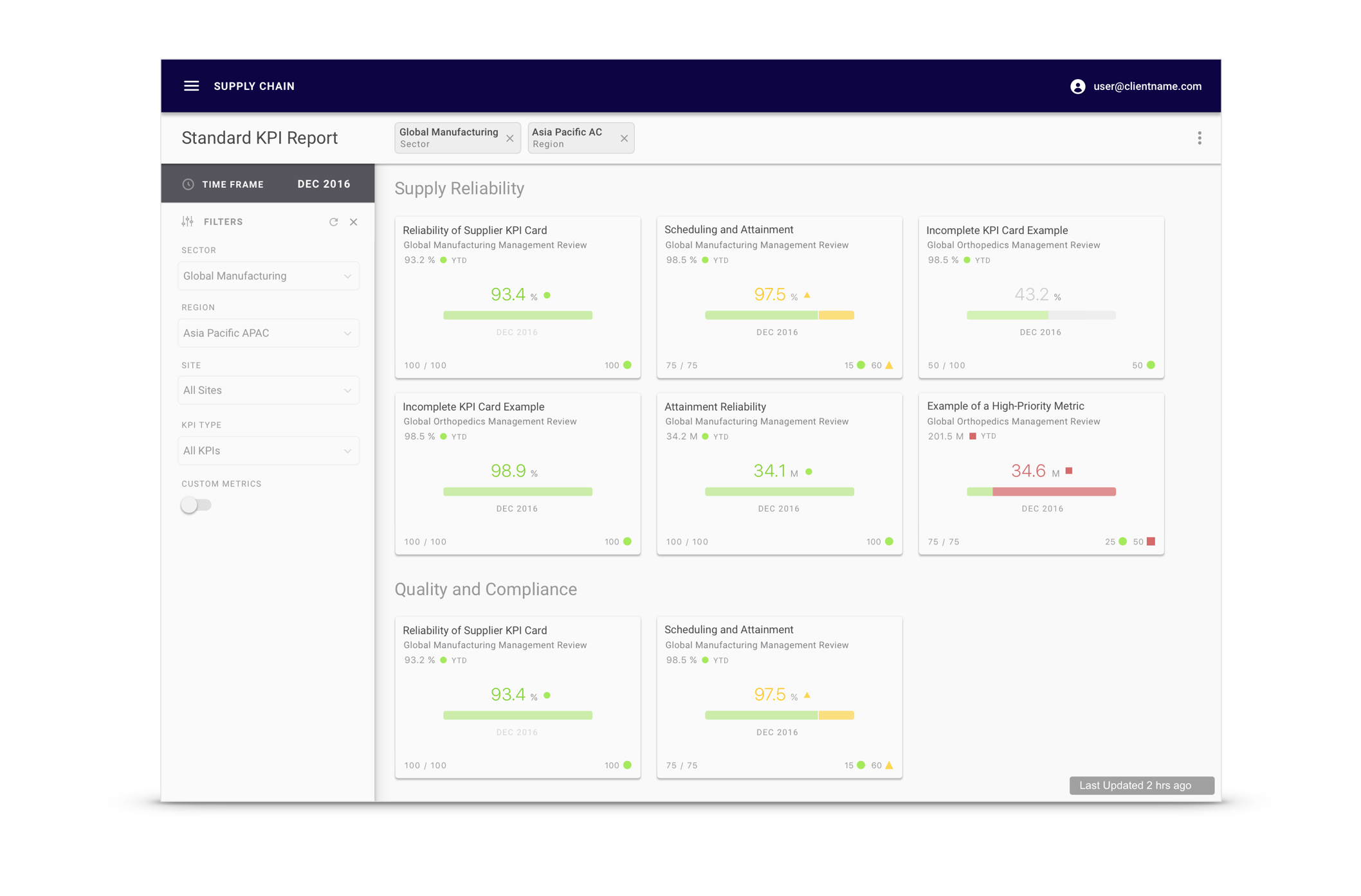
We found that users valued the ability to toggle between viewing reports as rows or stacked cards. The rows expedited quick views — "for when you're in a hurry at the end of a reporting cycle".
The stacked cards view was preferred when users were "in presentation mode". This is the view that would eliminate the current reports, which resemble the cards but are arranged manually in presentation software like powerpoint.
Reducing manual processes is a big win for this platform: it increases the accuracy of the reports and increases users' confidence in the data they contain.
The Outcome
A new reporting platform that boosts efficiency by reducing the time spent collecting and verifying data. The responsive design makes it accessible in web browsers across devices, allowing business leaders to focus on performance and solution planning.
Validating feature sets with users with interactive prototypes cut down on development time and ensured little to no training requirements upon release.

