The Ask: Reduce Call Center Volume
Independence Blue Cross (IBX) provides insurance for thousands of Pennsylvania residents. The top four reasons members call IBX call centers are to find or order their insurance card, to view a past claim, find a doctor, or make a payment. The member portal they had in place contained all this information — but it wasn't easily accessible.
Before
After Redesign
The redesigned homepage reduced call center volume by 79% during a 2-week trial with a virtual testing panel of 1,200 actual members.
Re-Design Process
Step 1 — Exploring through rapid ideation
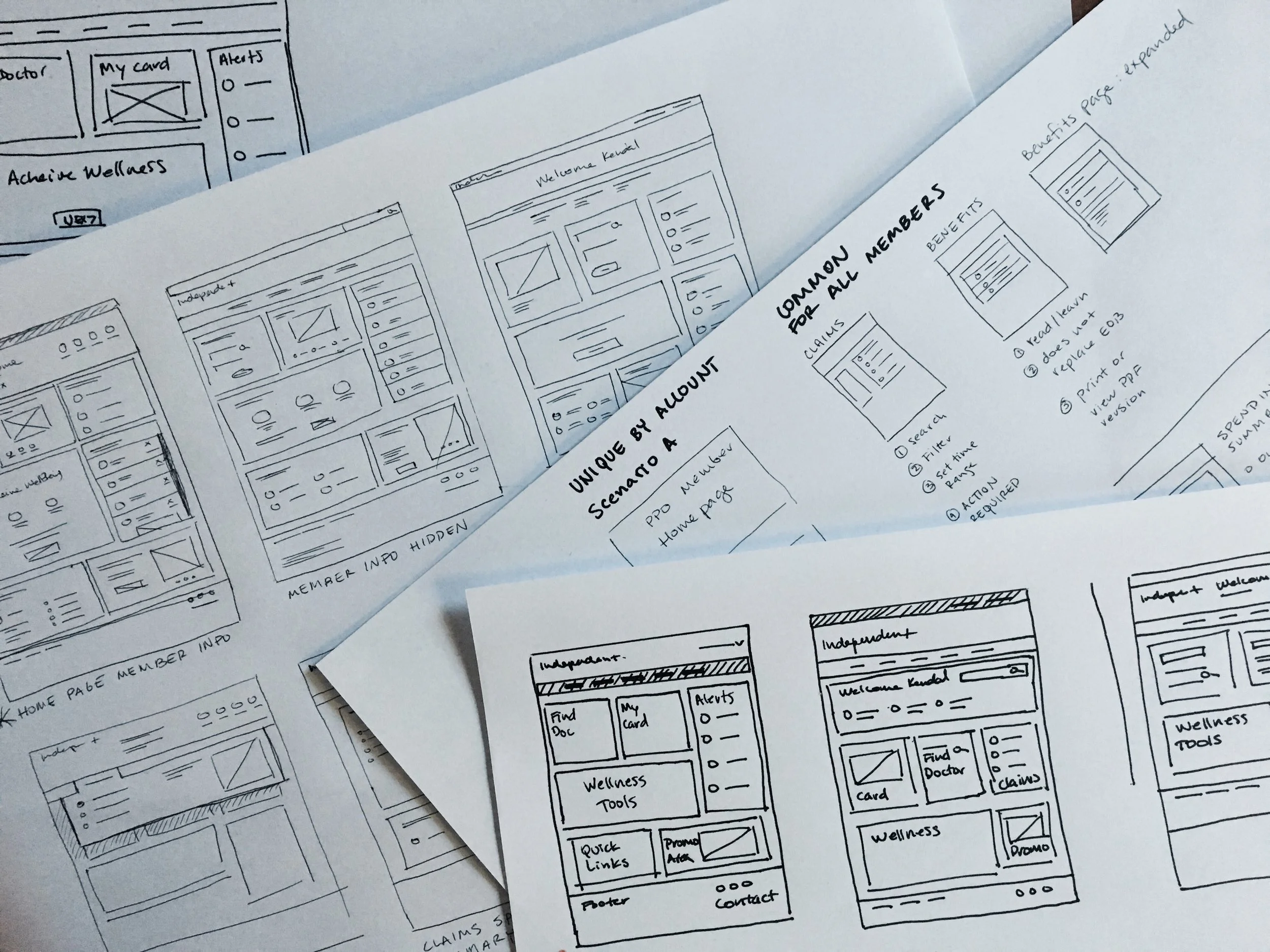
Explore different ways to organize the page content in sketches. Hand-drawn sketches allow for a quick flow of ideas and variations.
Step 2 – Low fidelity prototypes
I created low-fidelity digital wireframes in Sketch and Invision app. Here I began to establish global interaction patterns like site navigation and clickthroughs to internal pages.
All content and interactions were reviewed and validated by IBX's internal engineering team to ensure that re-designed page would be technically feasible.
Home Page, Nav Overlay, and Claims Page
Benefits Page, Benefits Usage Summary, and Expanded Claims Details
Step 3 – Test usability with interactive prototypes
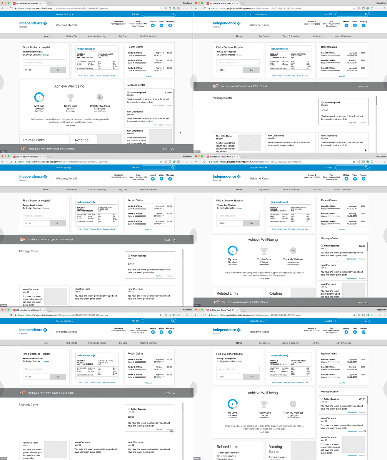
IBX internal marketing team was concerned that new messages could be lost, so we tested two possible message notifications. One at the top right that follows their existing convention, and a contextual message alert that sticks to the browser the footer. This second alternative was favored by users for high priority messages.
I created interactive Invision prototypes of each solution. Users preferred the sticky footer option and it also satisfied the internal communications team at IBX
Here's a working file where I'm developing workflow iterations using Sketch. The ability to test with Invision makes Sketch a powerful prototyping tool.
Final Step – Visual refinements & file delivery
Pattern Library
Because the back-end developers were not familiar with Sketch, I created a pattern library in Photoshop as well as a clickable prototype in Invision.


